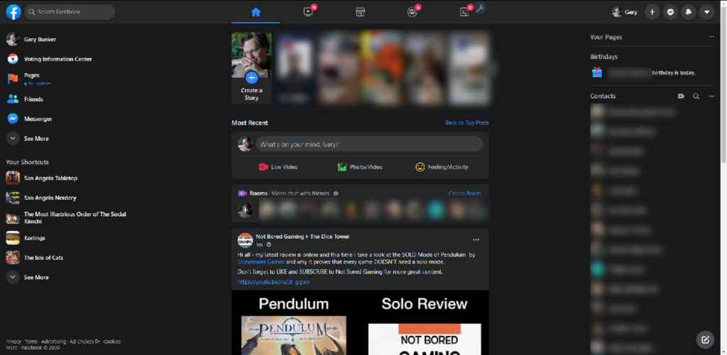
I had the latest and greatest version of Facebook’s interface force-updated recently. Like so many recent website updates, it appears that the intended audience either can’t see very well, or is using the website with a touch screen. Here’s my standard home screen under the old theme:

This is what it looks like on a 1080p monitor if I maximize the browser. Obviously, I never maximize the browser for Facebook – it wastes half the width of the screen. But, you can see over a dozen links on the left, including my curated list of shortcuts, and you can see one full post from a group I belong to, and the beginning of another. Here’s that same data, with the new theme:

It still wastes some space if you maximize it, but it isn’t quite as egregious. What is egregious, though, is that Facebook now decides that I need to see “Stories” (a feature almost nobody uses on purpose) and provides the option to create a random group (a feature almost nobody understand the purpose of). Those aren’t optional, and they waste a lot of vertical space. Meanwhile, the “contacts” list, which was collapsible in the classic mode, is just there all the time, providing visual clutter.
Look at the “classic” theme again, and you’ll see small numbers next to some of the shortcuts on the left. This shows, at a glance, how many posts or comments are unread in specific groups or pages. The equivalent information in the new theme is just all clumped together in the fourth icon on the top row. That claims there are six groups with new comments or posts, but I don’t know which group unless I click that icon. Maybe some groups are things I care about deeply, and others only casually. Too bad – they’re all the same now.
Over in the chat and notification drop-downs, we have more insults to efficiency. I’m not going to show screen shots, because I don’t want to blur out everything repeatedly, but you can conduct this experiment on your own. In the chat menu, at the bottom of the legacy view, is “Mark all read.” Boom, now the slate is wiped clean and you are all caught up. That option is completely missing in the new view. In the notification menu, the legacy mode shows “mark all read” right at the top, very easy. The new view hides it under a menu of other options that you’ll likely never use.
There are a number of other minor annoyances. Even if you can’t use plugins (like Social Fixer that you can see in my screen shots), the legacy view allows you to switch from the much-reviled default “top stories” view into a “recent” view that is vastly more intuitive. The new view doesn’t have that feature on the “news feed” menu option (because that option is missing), and instead it is under the down-arrow in an option called “recent” – at least it’s there, but it’s more work to get to. When reposting a link, in the classic view, we have the option to “include original†which would repost the link and the commentary from the person’s post where you found it. In the new theme, there is no option — your new post will include the link to the source and nothing else.
Why does Facebook want to make using their service more tedious?


 Categories
 Tag Cloud
 Blog RSS
 Comments RSS
 Last 50 Posts
 Back
Back Void
Void  Life
Life  Earth
Earth  Wind
Wind  Water
Water  Fire
Fire