
Making a userpic like the following, with a bar of semi-transparent color between the text and background, is somewhat popular.
This effect is a function of transparent layers. The image above consists of three layers (using Photoshop for my example) - the background, the box, and the text. The box and text layers each have some kind of blending effect applied to them.
 We start with the background layer. I used Kai's Powertools 3 to make this texture,
but you can use whatever graphic you want. I usually work on userpics zoomed
into about 400% so I can get the positioning perfect. Also, I run my computer
at a much higher resolution than most of the folks browsing the web (based on
my logfiles anyway), so I want to see what they see.
We start with the background layer. I used Kai's Powertools 3 to make this texture,
but you can use whatever graphic you want. I usually work on userpics zoomed
into about 400% so I can get the positioning perfect. Also, I run my computer
at a much higher resolution than most of the folks browsing the web (based on
my logfiles anyway), so I want to see what they see.
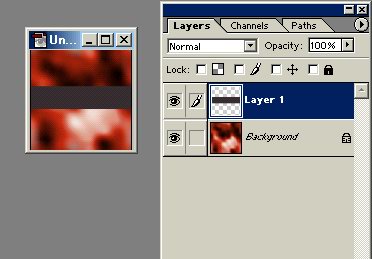 The next layer is added. I just chose the "new layer" button on the
bottom of the pallete, and drew a grey box.
The next layer is added. I just chose the "new layer" button on the
bottom of the pallete, and drew a grey box.
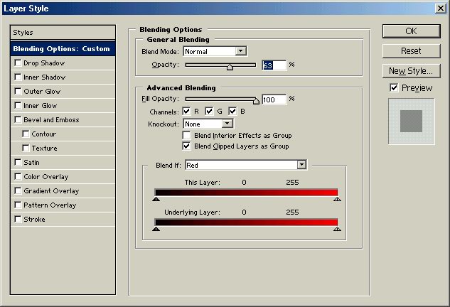 The blending options for this layer. I didn't mess with any of the advanced
options, although they can be used to make a really quick contoured button with
a dropshadow or outer glow, if you like. I just dropped the opacity level (called
transparency in the reverse for some programs) and hit OK.
The blending options for this layer. I didn't mess with any of the advanced
options, although they can be used to make a really quick contoured button with
a dropshadow or outer glow, if you like. I just dropped the opacity level (called
transparency in the reverse for some programs) and hit OK.
 The result of that 75% transparency for the layer.
 I added some text. By default in Photoshop, text is a new layer so all you need
to do is select the text tool and type away.
I added some text. By default in Photoshop, text is a new layer so all you need
to do is select the text tool and type away.
 These are the blending options I used on the text to make that funky yellow
look. You don't need to mess with the text layer's options if you want it to
be a solid color.
These are the blending options I used on the text to make that funky yellow
look. You don't need to mess with the text layer's options if you want it to
be a solid color.
The final result.
Notice the text is multicolored, following the gradient in the background pattern.
Here's another version, with more layer options added to both the box and text.
Hope this tutorial was helpful. I'm sure the techniques could be applied to PSP or other decent image editors.